Human-Computer Interaction, Usability, and AI UX: A Practical Guide
A long-form educational guide to HCI, usability testing, user-centered design, cognitive load, color, accessibility, and LLM usability.
Human-Computer Interaction, usually shortened to HCI, is the study of how people interact with technology and how interactive systems should be designed. It connects software engineering, psychology, design, usability, and human behavior.
HCI matters because a system can be technically correct and still fail in real use. If users cannot understand what to do, cannot recover from mistakes, or cannot trust the system’s feedback, the software is incomplete from a human perspective.
This guide merges the most important foundations into one long article:
- HCI and usability fundamentals
- usability testing and evaluation methods
- user-centered design, design thinking, and prototyping
- cognitive load, affordances, feedback, and interface clarity
- color, visual hierarchy, and accessibility
- usability for AI and Large Language Models
The goal is not to summarize lecture slides one by one. The goal is to build a practical mental model for designing better interactive systems.
1. HCI as the Practical Foundation
HCI studies the relationship between the human, the computer, and the context of use. A user never interacts with a system in isolation. They bring expectations, goals, habits, device limitations, attention limits, and different levels of technical knowledge.
Good interface design starts with questions such as:
- Who will use this system?
- What goal are they trying to achieve?
- What information do they need at each step?
- What mistakes are likely?
- What feedback does the system provide?
- How much effort is required to learn the interface?
These questions are not cosmetic. They directly affect software quality.
HCI, UI, and UX
| Term | Main focus | Example question |
|---|---|---|
| HCI | Human interaction with technology | How do people understand and control this system? |
| UI | Interface elements | Are buttons, forms, menus, and layouts clear? |
| UX | Overall experience | Does the whole journey feel useful, reliable, and understandable? |
HCI provides the research foundation. UI is the visible interaction layer. UX is the broader result of the system’s usefulness, usability, trust, performance, language, feedback, and emotional effect.
Usability Is Not Decoration
Usability is often mistaken for visual polish. In reality, usability is a functional quality. It describes whether users can complete tasks effectively, efficiently, and with satisfaction.
A usable interface usually has:
- clear navigation
- understandable labels
- predictable actions
- useful feedback
- recoverable errors
- consistent interaction patterns
Visual design matters, but only when it supports comprehension and action.
2. Usability Testing and Evaluation Methods
Usability testing is one of the most practical ways to understand whether a system works for real users. Instead of only asking for opinions, a usability test observes users while they complete realistic tasks.
The goal is not to judge the user. The goal is to discover where the interface fails to support the user.
A Basic Usability Test Flow
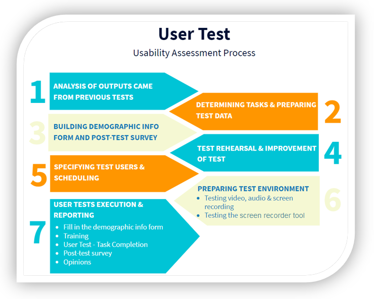
A basic usability test can be organized like this:
| Step | Purpose | Practical note |
|---|---|---|
| Define tasks | Choose important workflows | Use real-life tasks, not artificial button-click instructions |
| Prepare data | Avoid setup noise | Accounts, sample records, files, and form data should be ready |
| Recruit users | Match the target audience | Users should represent real experience levels |
| Observe behavior | Find confusion and errors | Watch hesitation, repeated clicks, wrong paths, and recovery attempts |
| Ask follow-up questions | Understand perception | Ask what users expected and what felt unclear |
| Prioritize fixes | Turn findings into design work | Repeated and task-blocking problems come first |
Writing Good Task Scenarios
A task should describe a goal, not the exact steps.
Weak task:
Click Settings and change your email notification preference.
Better task:
You no longer want to receive email notifications. Please change your notification preference.
The second version shows whether the interface itself communicates where to go.
What to Collect
A usability session can combine observation and short questionnaires.
Useful signals include:
- task completion success
- time on task
- points of confusion
- errors and recovery attempts
- user comments
- post-test satisfaction
- perceived clarity of language, icons, colors, and feedback
The most valuable findings often come from repeated patterns. If several users misunderstand the same label, the label is probably the problem.
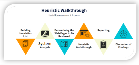
Other Evaluation Methods
Usability testing is not the only evaluation method. Depending on the project, teams may also use:
- heuristic evaluation
- heuristic walkthrough
- questionnaires
- interviews
- log analysis
- heatmaps
- accessibility checks
The best method depends on the maturity of the design and the type of evidence needed.
3. User-Centered Design, Design Thinking, and Prototyping
User-centered design means that users, their goals, tasks, and environment are considered throughout development. It is not a single meeting at the beginning of a project. It is an iterative process.
Human-centered design standards commonly emphasize:
- understanding the context of use
- specifying user and organizational requirements
- producing design solutions
- evaluating designs with users
- iterating based on evidence
Design thinking supports this process by encouraging teams to understand people before jumping to solutions.
From Sketch to Prototype
Design artifacts have different levels of detail:
| Artifact | Purpose | Typical use |
|---|---|---|
| Sketch | Explore rough ideas quickly | Early brainstorming |
| Wireframe | Show layout and structure | Page organization and navigation |
| Mockup | Show visual design more clearly | Visual review and stakeholder discussion |
| Prototype | Simulate interaction | Usability testing and workflow validation |
The important point is not to make every artifact perfect. The point is to learn at the right cost. A quick sketch can prevent expensive implementation mistakes.
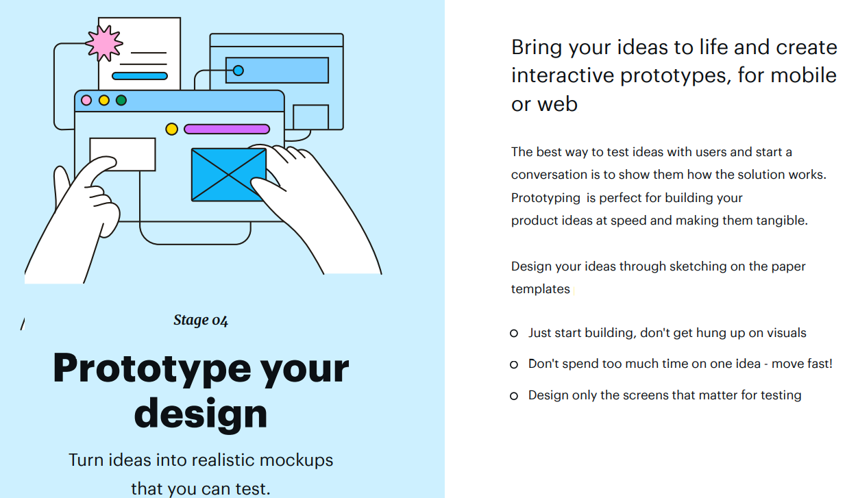
Why Prototypes Matter
A prototype lets teams test assumptions before building the final system. Users can react to workflow, labels, layout, and interaction behavior. Developers can discover unclear requirements earlier.
Good prototypes answer questions such as:
- Can users find the main action?
- Is the workflow in the right order?
- Are labels understandable?
- Does the user know what happened after each step?
- Are errors preventable or recoverable?
Prototyping is not a design luxury. It is a risk-reduction method.
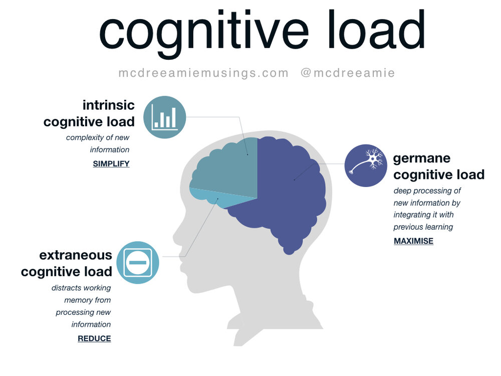
4. Cognitive Load, Affordances, and Interface Clarity
Cognitive load is the mental effort required to process information. Interfaces create high cognitive load when users must remember too much, interpret unclear labels, compare too many options, or guess system behavior.
High cognitive load often appears as:
- hesitation before clicking
- repeated reading
- backtracking between screens
- wrong form entries
- overdependence on help documents
- user fatigue after simple tasks
The goal is not to remove all complexity. Some tasks are naturally complex. The goal is to remove unnecessary complexity.
Common Sources of Cognitive Load
| Source | Why it creates effort | Better approach |
|---|---|---|
| Too many choices | Users must compare everything | Prioritize common actions |
| Unclear labels | Users must guess meaning | Use task-oriented language |
| Hidden system state | Users do not know what happened | Show feedback and progress |
| Inconsistent layouts | Users must relearn patterns | Reuse predictable structures |
| Memory dependency | Users must remember previous steps | Keep relevant context visible |
Affordances
An affordance is a clue about how something can be used. A button should look clickable. A slider should suggest dragging. A text input should suggest typing.
When affordances are weak, users hesitate. When affordances are misleading, users make errors.
Feedback and Feedforward
Feedback tells the user what happened after an action. Feedforward helps the user understand what will happen before the action.
Examples:
- A disabled button explains that required fields are missing.
- A loading state shows that the system is processing.
- A confirmation message shows that changes were saved.
- A preview shows the result before publishing.
Good interfaces reduce uncertainty before and after user actions.
5. Color, Visual Hierarchy, and Accessibility
Color influences emotion, attention, grouping, and meaning. In interface design, color should not be chosen only by taste. It should support readability, hierarchy, feedback, and accessibility.
Common color associations include:
| Color | Common association | Interface use |
|---|---|---|
| Blue | Trust, stability | Links, primary actions, professional interfaces |
| Red | Danger, urgency | Error states, destructive actions |
| Green | Success, progress | Success messages, completed states |
| Yellow or orange | Warning, attention | Caution states and notices |
These associations are culturally influenced, so designers should not rely on color alone.
Color Contrast
Adequate contrast is essential for readability, especially for users with visual impairments. Text and background colors must be clearly distinguishable. Low-contrast interfaces may look soft, but they can become unreadable.
Do Not Use Color as the Only Signal
If an error is shown only with red color, some users may miss it. Pair color with text, icons, labels, or layout changes.
For example:
- show an error message next to the field
- use an icon plus color for status
- provide text labels such as “Success”, “Warning”, or “Error”
Visual Hierarchy
Visual hierarchy tells users what matters first. Size, spacing, contrast, alignment, and grouping help users scan a page.
A good hierarchy answers:
- What is the main action?
- What is supporting information?
- What is optional?
- What should the user read first?
Without hierarchy, everything competes for attention.
6. Usability for AI and Large Language Models
Large Language Models introduce a new kind of interaction. Users do not only click fixed controls; they describe goals in natural language and receive generated responses. This makes interaction flexible, but also uncertain.

Traditional usability principles still matter, but LLMs need additional criteria.
Why LLM Usability Is Different
Classic software is usually deterministic. The same action with the same input normally gives the same result. LLM systems are probabilistic and context-sensitive. They may produce different outputs, misunderstand intent, or generate fluent but incorrect answers.
This creates new usability questions:
- Did the model understand the user’s intent?
- Is the answer correct or only confident?
- Can the user control tone, length, format, and constraints?
- Does the system show uncertainty?
- Can the user recover from a bad answer?
- Does the interface help the user write better prompts?
LLM-Specific Usability Criteria
| Criterion | What it evaluates |
|---|---|
| Intent understanding | Whether the model responds to the actual user goal |
| Transparency | Whether limitations and uncertainty are visible |
| Controllability | Whether users can steer tone, length, format, and constraints |
| Recoverability | Whether users can correct, refine, or regenerate poor outputs |
| Trust calibration | Whether users trust the system at the right level |
| Prompt support | Whether the interface helps users express requests clearly |
Prompting Is Part of the Interface
In LLM systems, the prompt box is not just an input field. It is a core interaction surface. Good AI interfaces help users communicate intent through examples, templates, constraints, follow-up suggestions, and structured input modes.
Recovery Matters More Than Perfection
No LLM system will always answer perfectly. A usable AI interface should make correction easy. Users should be able to refine, compare, regenerate, ask for explanation, and narrow the scope without starting over.
In AI UX, the best interface is not the one that pretends the model is always right. It is the one that helps users work productively despite uncertainty.
Final Takeaways
HCI is the bridge between technical systems and human behavior. A good interface is not only functional; it is understandable, learnable, forgiving, and trustworthy.
The most important lessons are:
- Design around real user goals.
- Test realistic tasks, not only screens.
- Use prototypes to learn before implementation.
- Reduce unnecessary cognitive load.
- Make affordances and feedback clear.
- Use color to support meaning, not replace it.
- Treat LLM usability as a human-AI interaction problem, not only a model-performance problem.
Conclusion
Human-Computer Interaction is practical software quality. It helps teams build systems that people can understand and use confidently. As interfaces become more adaptive, conversational, and AI-driven, HCI becomes even more important.
The future of software is not only about more powerful systems. It is about systems that communicate clearly with the people who use them.